PlotlyChart
Displays Plotly chart.
Examples
Line chart
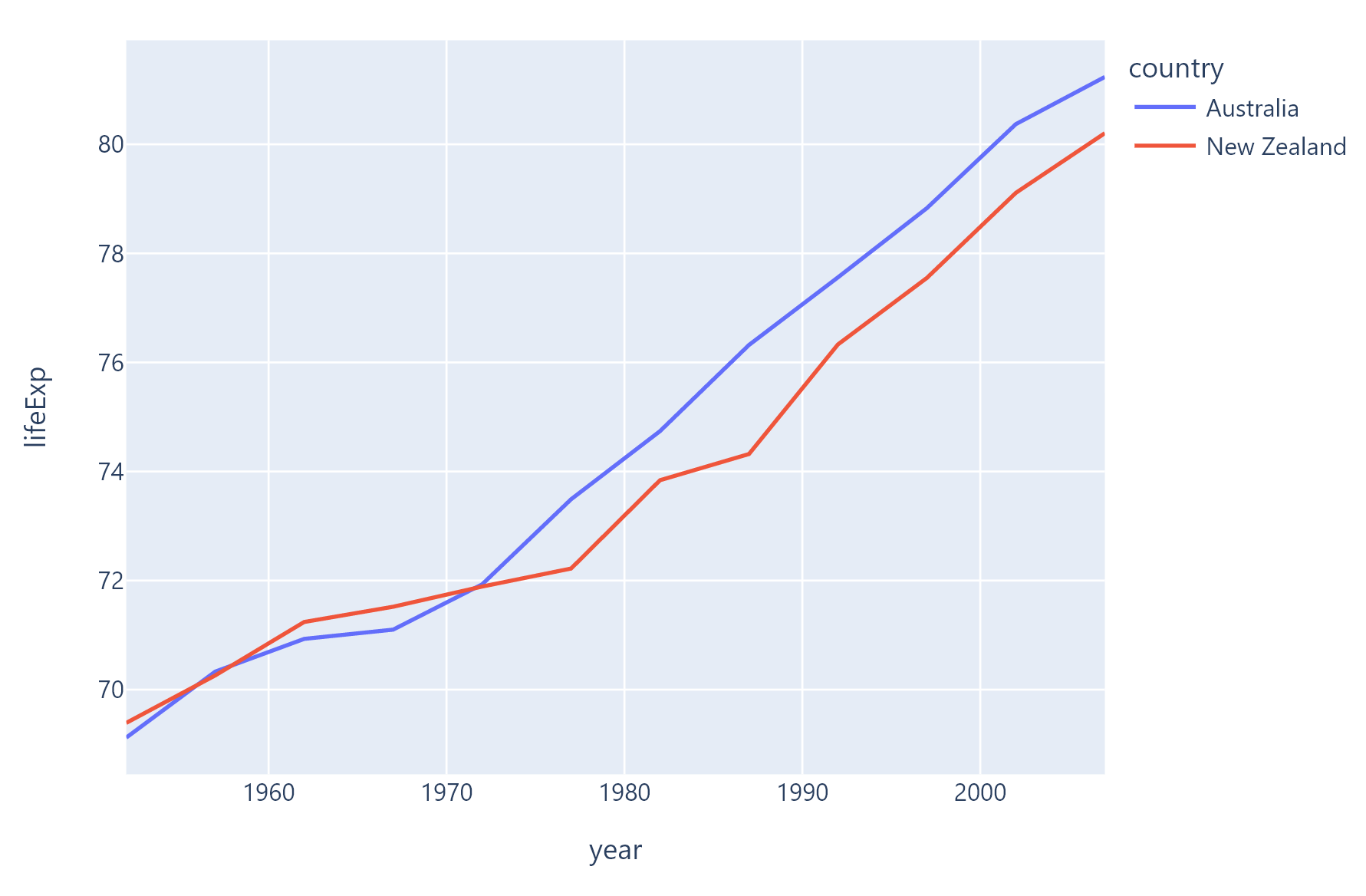
The following example is based on original example from Plotly docs.

import plotly.express as px

import flet as ft
from flet.plotly_chart import PlotlyChart

def main(page: ft.Page):

    df = px.data.gapminder().query("continent=='Oceania'")
    fig = px.line(df, x="year", y="lifeExp", color="country")

    page.add(PlotlyChart(fig, expand=True))

ft.app(target=main)
Bar chart
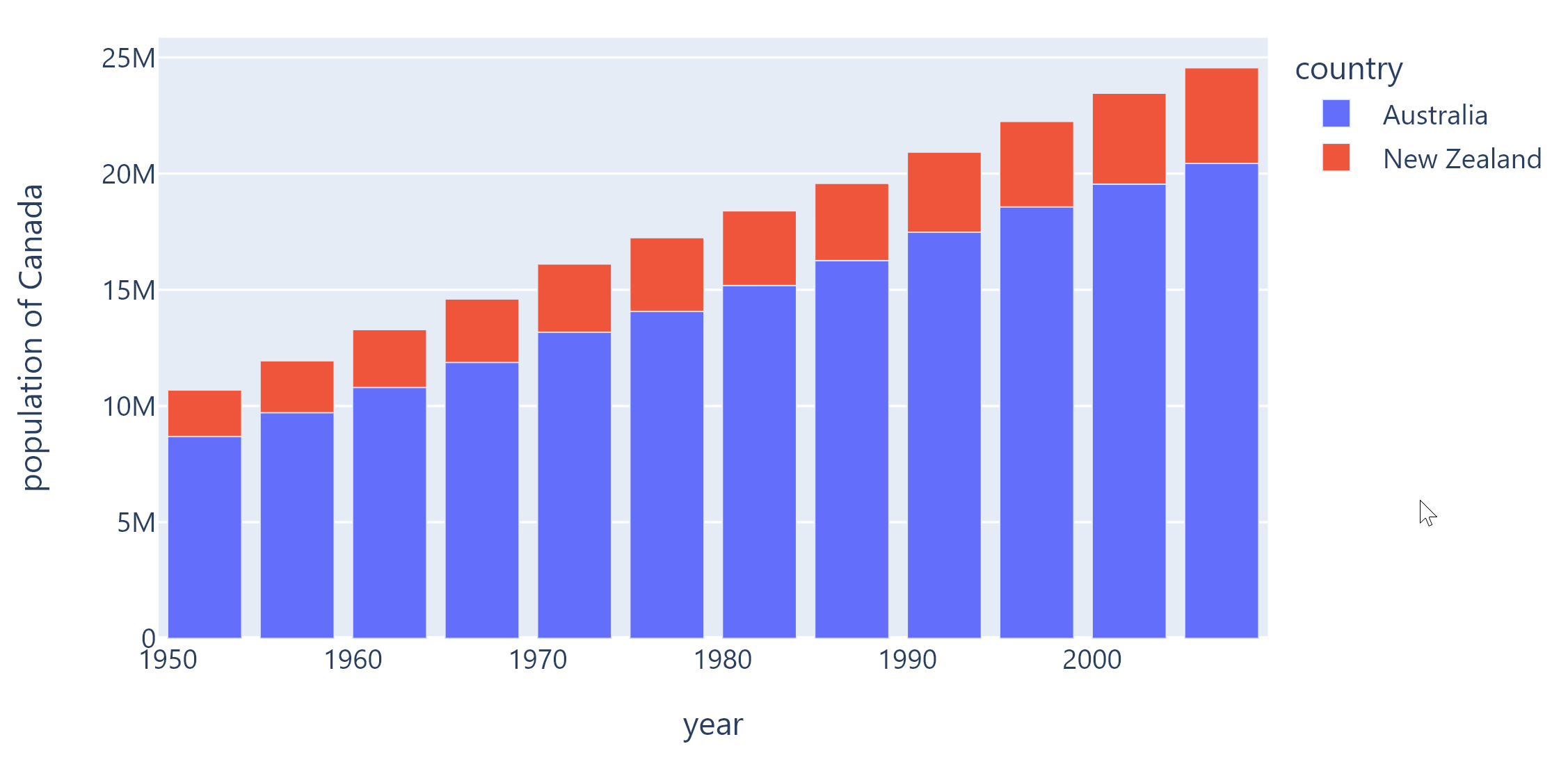
The following example is based on original example from Plotly docs.

import plotly.express as px

import flet as ft
from flet.plotly_chart import PlotlyChart

def main(page: ft.Page):

    df = px.data.gapminder().query("continent == 'Oceania'")
    fig = px.bar(
        df,
        x="year",
        y="pop",
        hover_data=["lifeExp", "gdpPercap"],
        color="country",
        labels={"pop": "population of Canada"},
        height=400,
    )

    page.add(PlotlyChart(fig, expand=True))

ft.app(target=main)
Pie chart
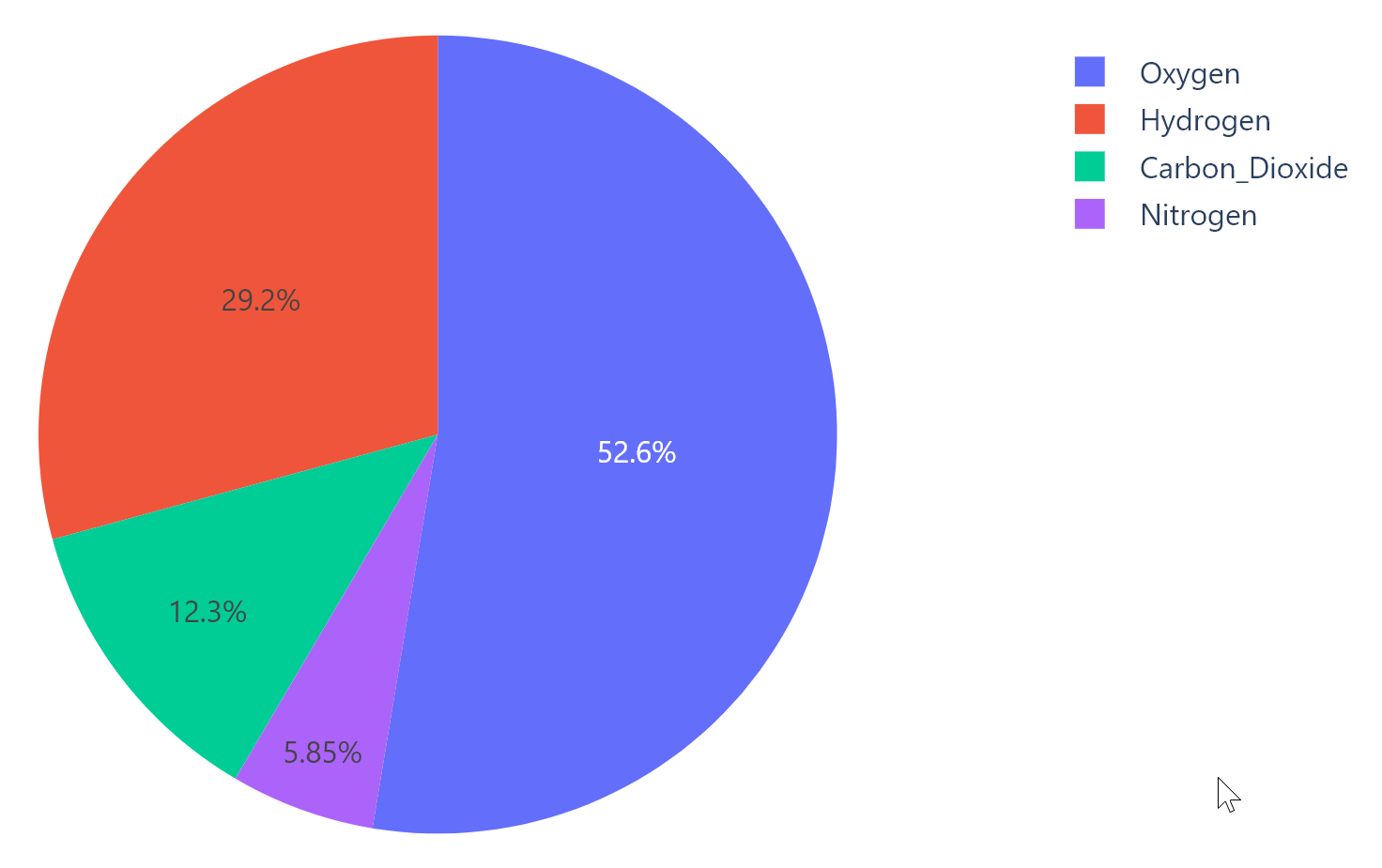
The following example is based on original example from Plotly docs.

import plotly.graph_objects as go

import flet as ft
from flet.plotly_chart import PlotlyChart

def main(page: ft.Page):

    labels = ["Oxygen", "Hydrogen", "Carbon_Dioxide", "Nitrogen"]
    values = [4500, 2500, 1053, 500]

    fig = go.Figure(data=[go.Pie(labels=labels, values=values)])

    page.add(PlotlyChart(fig, expand=True))

ft.app(target=main)
Box chart
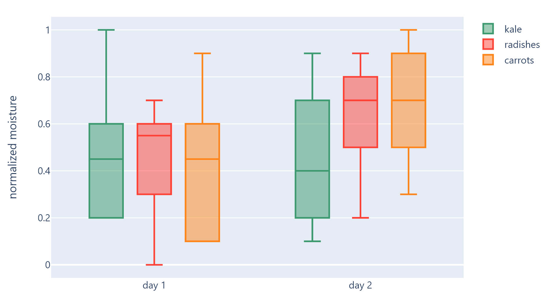
The following example is based on original example from Plotly docs.

import plotly.graph_objects as go

import flet as ft
from flet.plotly_chart import PlotlyChart


def main(page: ft.Page):

    x = ['day 1', 'day 1', 'day 1', 'day 1', 'day 1', 'day 1',
        'day 2', 'day 2', 'day 2', 'day 2', 'day 2', 'day 2']

    fig = go.Figure()

    fig.add_trace(go.Box(
        y=[0.2, 0.2, 0.6, 1.0, 0.5, 0.4, 0.2, 0.7, 0.9, 0.1, 0.5, 0.3],
        x=x,
        name='kale',
        marker_color='#3D9970'
    ))
    fig.add_trace(go.Box(
        y=[0.6, 0.7, 0.3, 0.6, 0.0, 0.5, 0.7, 0.9, 0.5, 0.8, 0.7, 0.2],
        x=x,
        name='radishes',
        marker_color='#FF4136'
    ))
    fig.add_trace(go.Box(
        y=[0.1, 0.3, 0.1, 0.9, 0.6, 0.6, 0.9, 1.0, 0.3, 0.6, 0.8, 0.5],
        x=x,
        name='carrots',
        marker_color='#FF851B'
    ))

    fig.update_layout(
        yaxis_title='normalized moisture',
        boxmode='group' # group together boxes of the different traces for each value of x
    )

    page.add(PlotlyChart(fig, expand=True))

ft.app(target=main)
Properties
figure
Plotly figure to draw - an instance of plotly.graph_objects.Figure class.
original_size
True to display chart in original size. False (default) to display a chart that fits configured bounds.
isolated
Every time when a page or parent chart control are updated with page.update() or Control.update() methods respectively the chart is re-drawn by calling Plotly API. Frequent re-drawings of large charts could affect the performance of the entire Flet app.
Set isolated to True to enable explicit chart updates. To re-draw the chart call its update() method.