AppBar
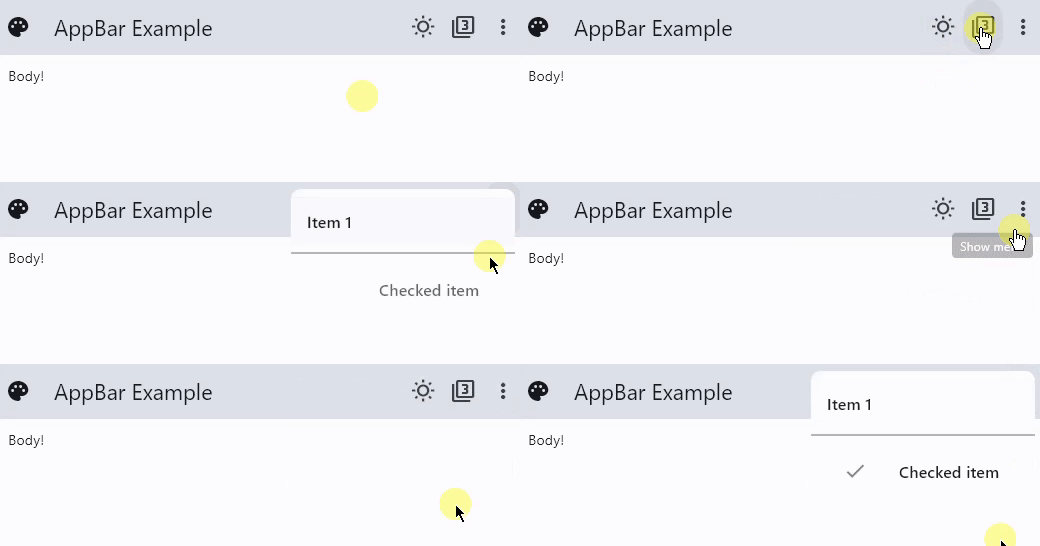
A material design app bar.
Examples
AppBar
- Python
import flet as ft

def main(page: ft.Page):
    def check_item_clicked(e):
        e.control.checked = not e.control.checked
        page.update()

    page.appbar = ft.AppBar(
        leading=ft.Icon(ft.icons.PALETTE),
        leading_width=40,
        title=ft.Text("AppBar Example"),
        center_title=False,
        bgcolor=ft.colors.SURFACE_VARIANT,
        actions=[
            ft.IconButton(ft.icons.WB_SUNNY_OUTLINED),
            ft.IconButton(ft.icons.FILTER_3),
            ft.PopupMenuButton(
                items=[
                    ft.PopupMenuItem(text="Item 1"),
                    ft.PopupMenuItem(),  # divider
                    ft.PopupMenuItem(
                        text="Checked item", checked=False, on_click=check_item_clicked
                    ),
                ]
            ),
        ],
    )
    page.add(ft.Text("Body!"))

ft.app(target=main)
Properties
actions
A list of Controls to display in a row after the title control.
Typically these controls are IconButtons representing common operations. For less common operations, consider using a PopupMenuButton as the last action.
automatically_imply_leading
Controls whether we should try to imply the leading widget if null.
If True and leading is null, automatically try to deduce what the leading widget should be. If False and leading is null, leading space is given to title. If leading widget is not null, this parameter has no effect.
bgcolor
The fill color to use for an AppBar. Default color is defined by current theme.
center_title
Whether the title should be centered. Default is False.
color
The default color for Text and Icons within the app bar. Default color is defined by current theme.
elevation
This property controls the size of the shadow below the app bar. Default value is 4.
Note: This effect is only visible when using the Material 2 design (when Theme.use_material3=False).
leading
A Control to display before the toolbar's title.
Typically the leading control is an Icon or an IconButton.
leading_width
Defines the width of leading control. By default, the value of leading_width is 56.0.
title
The primary Control displayed in the app bar. Typically a Text control that contains a description of the current contents of the app.
toolbar_height
Defines the height of the toolbar component of an AppBar. By default, the value of toolbar_height is 56.0.