Column
A control that displays its children in a vertical array.
To cause a child control to expand and fill the available vertical space set its expand property.
Examples
Column spacing
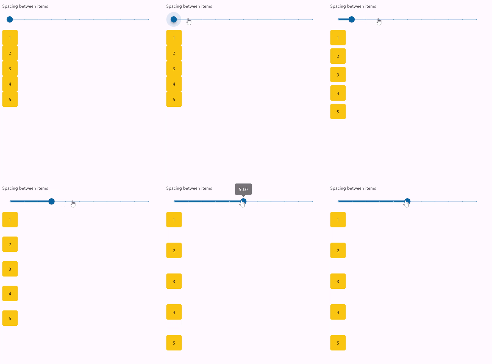
- Python
import flet as ft

def main(page: ft.Page):
    def items(count):
        items = []
        for i in range(1, count + 1):
            items.append(
                ft.Container(
                    content=ft.Text(value=str(i)),
                    alignment=ft.alignment.center,
                    width=50,
                    height=50,
                    bgcolor=ft.colors.AMBER,
                    border_radius=ft.border_radius.all(5),
                )
            )
        return items

    def spacing_slider_change(e):
        col.spacing = int(e.control.value)
        col.update()

    gap_slider = ft.Slider(
        min=0,
        max=100,
        divisions=10,
        value=0,
        label="{value}",
        width=500,
        on_change=spacing_slider_change,
    )

    col = ft.Column(spacing=0, controls=items(5))

    page.add(ft.Column([ ft.Text("Spacing between items"), gap_slider]), col)

ft.app(target=main)
Column wrapping
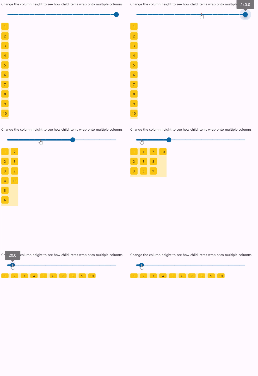
- Python
import flet as ft

HEIGHT = 400

def main(page: ft.Page):
    def items(count):
        items = []
        for i in range(1, count + 1):
            items.append(
                ft.Container(
                    content=ft.Text(value=str(i)),
                    alignment=ft.alignment.center,
                    width=30,
                    height=30,
                    bgcolor=ft.colors.AMBER,
                    border_radius=ft.border_radius.all(5),
                )
            )
        return items

    def slider_change(e):
        col.height = float(e.control.value)
        col.update()

    width_slider = ft.Slider(
        min=0,
        max=HEIGHT,
        divisions=20,
        value=HEIGHT,
        label="{value}",
        width=500,
        on_change=slider_change,
    )

    col = ft.Column(
        wrap=True,
        spacing=10,
        run_spacing=10,
        controls=items(10),
        height=HEIGHT,
    )

    page.add(
        ft.Column(
            [
                ft.Text(
                    "Change the column height to see how child items wrap onto multiple columns:"
                ),
                width_slider,
            ]
        ),
        ft.Container(content=col, bgcolor=ft.colors.AMBER_100),
    )

ft.app(target=main)
Column vertical alignments
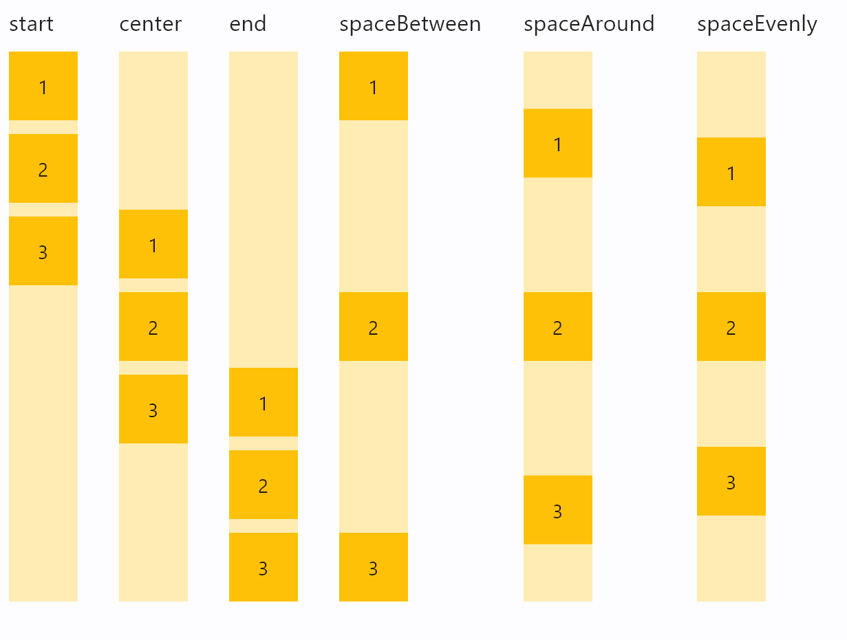
- Python
import flet as ft

def main(page: ft.Page):
    def items(count):
        items = []
        for i in range(1, count + 1):
            items.append(
                ft.Container(
                    content=ft.Text(value=str(i)),
                    alignment=ft.alignment.center,
                    width=50,
                    height=50,
                    bgcolor=ft.colors.AMBER_500,
                )
            )
        return items

    def column_with_alignment(align: ft.MainAxisAlignment):
        return ft.Column(
            [
                ft.Text(str(align), size=10),
                ft.Container(
                    content=ft.Column(items(3), alignment=align),
                    bgcolor=ft.colors.AMBER_100,
                    height=400,
                ),
            ]
        )

    page.add(
        ft.Row(
            [
                column_with_alignment(ft.MainAxisAlignment.START),
                column_with_alignment(ft.MainAxisAlignment.CENTER),
                column_with_alignment(ft.MainAxisAlignment.END),
                column_with_alignment(ft.MainAxisAlignment.SPACE_BETWEEN),
                column_with_alignment(ft.MainAxisAlignment.SPACE_AROUND),
                column_with_alignment(ft.MainAxisAlignment.SPACE_EVENLY),
            ],
            spacing=30,
            alignment=ft.MainAxisAlignment.START,
        )
    )

ft.app(target=main)
Column horizontal alignments
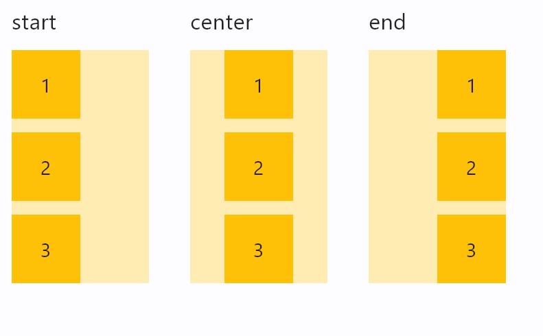
- Python
import flet as ft

def main(page: ft.Page):
    def items(count):
        items = []
        for i in range(1, count + 1):
            items.append(
                ft.Container(
                    content=ft.Text(value=str(i)),
                    alignment=ft.alignment.center,
                    width=50,
                    height=50,
                    bgcolor=ft.colors.AMBER_500,
                )
            )
        return items

    def column_with_horiz_alignment(align: ft.CrossAxisAlignment):
        return ft.Column(
            [
                ft.Text(str(align), size=16),
                ft.Container(
                    content=ft.Column(
                        items(3),
                        alignment=ft.MainAxisAlignment.START,
                        horizontal_alignment=align,
                    ),
                    bgcolor=ft.colors.AMBER_100,
                    width=100,
                ),
            ]
        )

    page.add(
        ft.Row(
            [
                column_with_horiz_alignment(ft.CrossAxisAlignment.START),
                column_with_horiz_alignment(ft.CrossAxisAlignment.CENTER),
                column_with_horiz_alignment(ft.CrossAxisAlignment.END),
            ],
            spacing=30,
            alignment=ft.MainAxisAlignment.START,
        )
    )

ft.app(target=main)
Infinite scroll list
The following example demonstrates adding of list items on-the-fly, as user scroll to the bottom, creating the illusion of inifinite list:
import threading
import flet as ft

class State:
    i = 0

s = State()
sem = threading.Semaphore()

def main(page: ft.Page):
    def on_scroll(e: ft.OnScrollEvent):
        if e.pixels >= e.max_scroll_extent - 100:
            if sem.acquire(blocking=False):
                try:
                    for i in range(0, 10):
                        cl.controls.append(ft.Text(f"Text line {s.i}", key=str(s.i)))
                        s.i += 1
                    cl.update()
                finally:
                    sem.release()

    cl = ft.Column(
        spacing=10,
        height=200,
        width=200,
        scroll=ft.ScrollMode.ALWAYS,
        on_scroll_interval=0,
        on_scroll=on_scroll,
    )
    for i in range(0, 50):
        cl.controls.append(ft.Text(f"Text line {s.i}", key=str(s.i)))
        s.i += 1

    page.add(ft.Container(cl, border=ft.border.all(1)))

ft.app(main)
Scrolling column programmatically
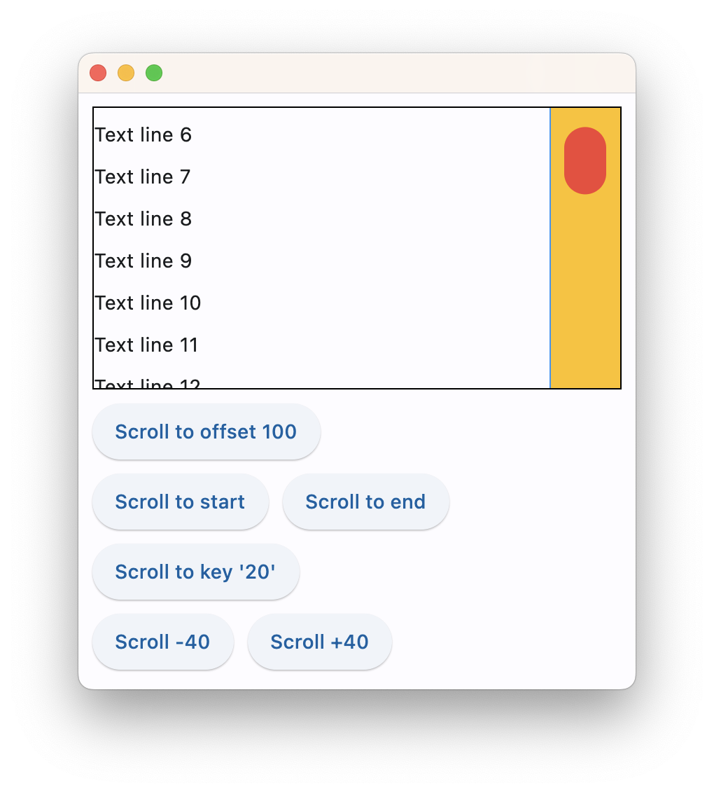
The following example demonstrates various scroll_to() options as well as defines a custom scrollbar theme:
import flet as ft

def main(page: ft.Page):
    page.theme = ft.Theme(
        scrollbar_theme=ft.ScrollbarTheme(
            track_color={
                ft.MaterialState.HOVERED: ft.colors.AMBER,
                ft.MaterialState.DEFAULT: ft.colors.TRANSPARENT,
            },
            track_visibility=True,
            track_border_color=ft.colors.BLUE,
            thumb_visibility=True,
            thumb_color={
                ft.MaterialState.HOVERED: ft.colors.RED,
                ft.MaterialState.DEFAULT: ft.colors.GREY_300,
            },
            thickness=30,
            radius=15,
            main_axis_margin=5,
            cross_axis_margin=10,
            # interactive=False,
        )
    )

    cl = ft.Column(
        spacing=10,
        height=200,
        width=float("inf"),
        scroll=ft.ScrollMode.ALWAYS,
    )
    for i in range(0, 100):
        cl.controls.append(ft.Text(f"Text line {i}", key=str(i)))

    def scroll_to_offset(e):
        cl.scroll_to(offset=100, duration=1000)

    def scroll_to_start(e):
        cl.scroll_to(offset=0, duration=1000)

    def scroll_to_end(e):
        cl.scroll_to(offset=-1, duration=2000, curve=ft.AnimationCurve.EASE_IN_OUT)

    def scroll_to_key(e):
        cl.scroll_to(key="20", duration=1000)

    def scroll_to_delta(e):
        cl.scroll_to(delta=40, duration=200)

    def scroll_to_minus_delta(e):
        cl.scroll_to(delta=-40, duration=200)

    page.add(
        ft.Container(cl, border=ft.border.all(1)),
        ft.ElevatedButton("Scroll to offset 100", on_click=scroll_to_offset),
        ft.Row(
            [
                ft.ElevatedButton("Scroll to start", on_click=scroll_to_start),
                ft.ElevatedButton("Scroll to end", on_click=scroll_to_end),
            ]
        ),
        ft.ElevatedButton("Scroll to key '20'", on_click=scroll_to_key),
        ft.Row(
            [
                ft.ElevatedButton("Scroll -40", on_click=scroll_to_minus_delta),
                ft.ElevatedButton("Scroll +40", on_click=scroll_to_delta),
            ]
        ),
    )

ft.app(main)
Properties
alignment
How the child Controls should be placed vertically.
Property value is MainAxisAlignment enum with the following values:
START(default)ENDCENTERSPACE_BETWEENSPACE_AROUNDSPACE_EVENLY
auto_scroll
True if scrollbar should automatically move its position to the end when children updated. Must be False for scroll_to() method to work.
controls
A list of Controls to display inside the Column.
horizontal_alignment
How the child Controls should be placed horizontally.
Property value is CrossAxisAlignment enum with the following values:
START(default)CENTERENDSTRETCHBASELINE
on_scroll_interval
Throttling in milliseconds for on_scroll event. Default is 10.
scroll
Enables a vertical scrolling for the Column to prevent its content overflow.
Property value is an optional ScrollMode enum with None as default.
Supported values:
None(default) - the column is non-scrollable and its content could overflow.AUTO- scrolling is enabled and scroll bar is only shown when scrolling occurs.ADAPTIVE- scrolling is enabled and scroll bar is always shown when running app as web or desktop.ALWAYS- scrolling is enabled and scroll bar is always shown.HIDDEN- scrolling is enabled, but scroll bar is always hidden.
spacing
Spacing between controls in a Column. Default value is 10 virtual pixels. Spacing is applied only when alignment is set to start, end or center.
run_spacing
Spacing between runs when wrap=True. Default value is 10.
tight
Specifies how much space should be occupied vertically. Default is False - allocate all space to children.
wrap
When set to True the Column will put child controls into additional columns (runs) if they don't fit a single column.
Methods
scroll_to(offset, delta, key, duration, curve)
Moves scroll position to either absolute offset, relative delta or jump to the control with specified key.
offset is an abosulte value between minimum and maximum extents of a scrollable control, for example:
products.scroll_to(offset=100, duration=1000)
offset could be a negative to scroll from the end of a scrollable. For example, to scroll to the very end:
products.scroll_to(offset=-1, duration=1000)
delta allows moving scroll relatively to the current position. Use positive delta to scroll forward and negative delta to scroll backward. For example, to move scroll on 50 pixels forward:
products.scroll_to(delta=50)
key allows moving scroll position to a control with specified key. Most of Flet controls have key property which is translated to Flutter as "global key". key must be unique for the entire page/view. For example:
import flet as ft

def main(page: ft.Page):
    cl = ft.Column(
        spacing=10,
        height=200,
        width=200,
        scroll=ft.ScrollMode.ALWAYS,
    )
    for i in range(0, 50):
        cl.controls.append(ft.Text(f"Text line {i}", key=str(i)))

    def scroll_to_key(e):
        cl.scroll_to(key="20", duration=1000)

    page.add(
        ft.Container(cl, border=ft.border.all(1)),
        ft.ElevatedButton("Scroll to key '20'", on_click=scroll_to_key),
    )

ft.app(main)
scroll_to() method won't work with ListView and GridView controls building their items dynamically.
duration is scrolling animation duration in milliseconds. Defaults to 0 - no animation.
curve configures animation curve. Defaults to ft.AnimationCurve.EASE.
Events
on_scroll
Fires when scroll position is changed by a user.
Event handler argument is an instance of ft.OnScrollEvent class with the following properties:
event_type(str) - type of the scroll event:start- control has started scrolling;update- control has changed its scroll position;end- control has stopped scrolling;user- user has changed the direction in which they are scrolling;over- control has not changed its scroll position because the change would have caused its scroll position to go outside its scroll bounds;
pixels(float) - The current scroll position, in logical pixels.min_scroll_extent(float) - The minimum in-range value forpixels.max_scroll_extent(float) - The maximum in-range value forpixels.viewport_dimension(float) - The extent of the viewport.scroll_delta(float) - The distance by which the scrollable was scrolled, in logical pixels. Set forupdateevents only.direction(str) - The direction in which the user is scrolling:idle,forward,reverse. Set foruserevents only.overscroll(float) - The number of logical pixels that the scrollable avoided scrolling. Set foroverevents only.velocity(float) - The velocity at which the ScrollPosition was changing when this overscroll happened. Set foroverevents only.
Expanding children
When a child Control is placed into a Column you can "expand" it to fill the available space. Every Control has expand property that can have either a boolean value (True - expand control to fill all available space) or an integer - an "expand factor" specifying how to divide a free space with other expanded child controls. For example, this code creates a column with a Container taking all available space and a Text control at the bottom serving as a status bar:
r = ft.Column([
  ft.Container(expand=True, content=ft.Text("Here is search results")),
  ft.Text("Records found: 10")
])
The following example with numeric expand factors creates a Column with 3 containers in it and having heights of 20% (1/5), 60% (3/5) and 20% (1/5) respectively:
r = ft.Column([
  ft.Container(expand=1, content=ft.Text("Header")),
  ft.Container(expand=3, content=ft.Text("Body")),
  ft.Container(expand=1, content=ft.Text("Footer"))
])
In general, the resulting height of a child in percents is calculated as expand / sum(all expands) * 100%.