Checkbox
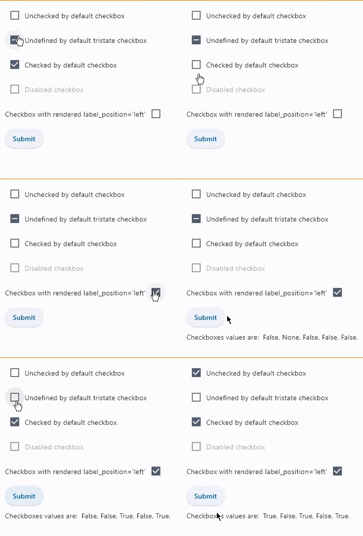
Checkbox allows to select one or more items from a group, or switch between two mutually exclusive options (checked or unchecked, on or off).
Examples
Basic checkboxes
- Python
import flet as ft

def main(page):
    def button_clicked(e):
        t.value = (
            f"Checkboxes values are:  {c1.value}, {c2.value}, {c3.value}, {c4.value}, {c5.value}."
        )
        page.update()

    t = ft.Text()
    c1 = ft.Checkbox(label="Unchecked by default checkbox", value=False)
    c2 = ft.Checkbox(label="Undefined by default tristate checkbox", tristate=True)
    c3 = ft.Checkbox(label="Checked by default checkbox", value=True)
    c4 = ft.Checkbox(label="Disabled checkbox", disabled=True)
    c5 = ft.Checkbox(
        label="Checkbox with rendered label_position='left'", label_position=ft.LabelPosition.LEFT
    )
    b = ft.ElevatedButton(text="Submit", on_click=button_clicked)
    page.add(c1, c2, c3, c4, c5, b, t)

ft.app(target=main)

Checkbox with on_change event
- Python
import flet as ft

def main(page):
  def checkbox_changed(e):
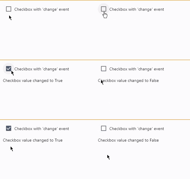
    t.value = f"Checkbox value changed to {c.value}"
    t.update()

  c = ft.Checkbox(label="Checkbox with 'change' event", on_change=checkbox_changed)
  t = ft.Text()

  page.add(c, t)

ft.app(target=main)

Properties
autofocus
True if the control will be selected as the initial focus. If there is more than one control on a page with autofocus set, then the first one added to the page will get focus.
check_color
The color to use for the check icon when this checkbox is checked.
fill_color
The color that fills the checkbox, in all Material states:
HOVEREDFOCUSEDPRESSEDDRAGGEDSELECTEDSCROLLEDUNDERDISABLEDERRORDEFAULT- fallback state, meaning "all other states".
To configure checkbox fill color for all Material states set fill_color value to a literal, for example:
chk.fill_color=ft.colors.GREEN
To configure fill color for specific Material states set its value to a dictionary where the key is state name. For example, to configure different fill colors for HOVERED and FOCUSED states and another color for all other states:
chk.fill_color={
    ft.MaterialState.HOVERED: ft.colors.GREEN,
    ft.MaterialState.FOCUSED: ft.colors.RED,
    ft.MaterialState.DEFAULT: ft.colors.BLACK,
}
label
The clickable label to display on the right of a checkbox.
label_position
Property value is LabelPosition enum with LabelPosition.RIGHT as default.
tristate
If True the checkbox's value can be True, False, or None (null).
Checkbox displays a dash when its value is null.
value
Current value of the checkbox.
Events
on_blur
Fires when the control has lost focus.
on_change
Fires when the state of the Checkbox is changed.
on_focus
Fires when the control has received focus.