Switch
A toggle represents a physical switch that allows someone to choose between two mutually exclusive options.
For example, "On/Off", "Show/Hide". Choosing an option should produce an immediate result.
Examples
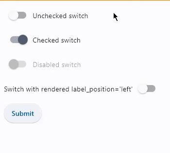
Basic switches
- Python
import flet as ft

def main(page):
    def button_clicked(e):
        t.value = (
            f"Switch values are:  {c1.value}, {c2.value}, {c3.value}, {c4.value}."
        )
        page.update()

    t = ft.Text()
    c1 = ft.Switch(label="Unchecked switch", value=False)
    c2 = ft.Switch(label="Checked switch", value=True)
    c3 = ft.Switch(label="Disabled switch", disabled=True)
    c4 = ft.Switch(
        label="Switch with rendered label_position='left'", label_position=ft.LabelPosition.LEFT
    )
    b = ft.ElevatedButton(text="Submit", on_click=button_clicked)
    page.add(c1, c2, c3, c4, b, t)

ft.app(target=main, view=ft.WEB_BROWSER)
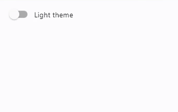
Switch with on_change event
- Python
import flet as ft

def main(page: ft.Page):
    def theme_changed(e):
        page.theme_mode = (
            ft.ThemeMode.DARK
            if page.theme_mode == ft.ThemeMode.LIGHT
            else ft.ThemeMode.LIGHT
        )
        c.label = (
            "Light theme" if page.theme_mode == ft.ThemeMode.LIGHT else "Dark theme"
        )
        page.update()

    page.theme_mode = ft.ThemeMode.LIGHT
    c = ft.Switch(label="Light theme", on_change=theme_changed)
    page.add(c)

ft.app(target=main)
Properties
active_color
The color to use when this switch is on.
active_track_color
The color to use on the track when this switch is on.
If track_color returns a non-null color in the selected state, it will be used instead of this color.
autofocus
True if the control will be selected as the initial focus. If there is more than one control on a page with autofocus set, then the first one added to the page will get focus.
inactive_thumb_color
The color to use on the thumb when this switch is off.
If thumb_color returns a non-null color in the default state, it will be used instead of this color.
inactive_track_color
The color to use on the track when this switch is off.
If track_color returns a non-null color in the default state, it will be used instead of this color.
label
The clickable label to display on the right of the Switch.
label_position
Property value is LabelPosition enum with LabelPosition.RIGHT as default.
thumb_color
The color of this Switch's thumb.
Resolved in the following MaterialState states:
SELECTEDHOVEREDFOCUSEDDISABLEDDEFAULT- fallback state, meaning "all other states".
To configure thumb color for all Material states set thumb_color value to a literal, for example:
sw.thumb_color=ft.colors.GREEN
To configure thumb color for specific Material states set its value to a dictionary where the key is state name. For example, to configure different fill colors for HOVERED and FOCUSED states and another color for all other states:
sw.thumb_color={
    ft.MaterialState.HOVERED: ft.colors.GREEN,
    ft.MaterialState.FOCUSED: ft.colors.RED,
    ft.MaterialState.DEFAULT: ft.colors.BLACK,
}
track_color
The color of this Switch's track.
Resolved in the following MaterialState states:
SELECTEDHOVEREDFOCUSEDDISABLEDDEFAULT- fallback state, meaning "all other states".
value
Current value of the Switch.
Events
on_blur
Fires when the control has lost focus.
on_change
Fires when the state of the Switch is changed.
on_focus
Fires when the control has received focus.