Radio
Radio buttons let people select a single option from two or more choices.
Examples
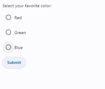
Basic RadioGroup
- Python
import flet as ft

def main(page):
  def button_clicked(e):
    t.value = f"Your favorite color is:  {cg.value}"
    page.update()

  t = ft.Text()
  b = ft.ElevatedButton(text='Submit', on_click=button_clicked)
  cg = ft.RadioGroup(content=ft.Column([
    ft.Radio(value="red", label="Red"),
    ft.Radio(value="green", label="Green"),
    ft.Radio(value="blue", label="Blue")]))

  page.add(ft.Text("Select your favorite color:"), cg, b, t)

ft.app(target=main)
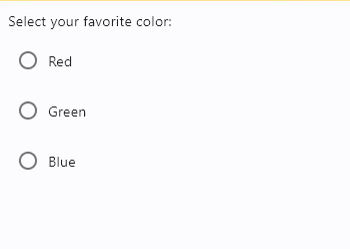
RadioGroup with on_change event
- Python
import flet as ft

def main(page):
  def radiogroup_changed(e):
    t.value = f"Your favorite color is:  {e.control.value}"
    page.update()

  t = ft.Text()
  cg = ft.RadioGroup(content=ft.Column([
    ft.Radio(value="red", label="Red"),
    ft.Radio(value="green", label="Green"),
    ft.Radio(value="blue", label="Blue")]), on_change=radiogroup_changed)

  page.add(ft.Text("Select your favorite color:"), cg, t)

ft.app(target=main)
RadioGroup properties
value
Current value of the RadioGroup.
RadioGroup events
on_change
Fires when the state of the RadioGroup is changed.
Radio properties
autofocus
True if the control will be selected as the initial focus. If there is more than one control on a page with autofocus set, then the first one added to the page will get focus.
fill_color
The color that fills the radio, in all MaterialState states:
HOVEREDFOCUSEDPRESSEDDRAGGEDSELECTEDSCROLLED_UNDERDISABLEDERRORDEFAULT- fallback state, meaning "all other states".
To configure radio fill color for all Material states set fill_color value to a literal, for example:
rd.fill_color=ft.colors.GREEN
To configure fill color for specific Material states set its value to a dictionary where the key is state name. For example, to configure different fill colors for HOVERED and FOCUSED states and another color for all other states:
rd.fill_color={
    ft.MaterialState.HOVERED: ft.colors.GREEN,
    ft.MaterialState.FOCUSED: ft.colors.RED,
    ft.MaterialState.DEFAULT: ft.colors.BLACK,
}
label
The clickable label to display on the right of a Radio.
label_position
Property value is LabelPosition enum with LabelPosition.RIGHT as default.
value
The value to set to containing RadioGroup when the radio is selected.
Radio events
on_blur
Fires when the control has lost focus.
on_focus
Fires when the control has received focus.