AlertDialog
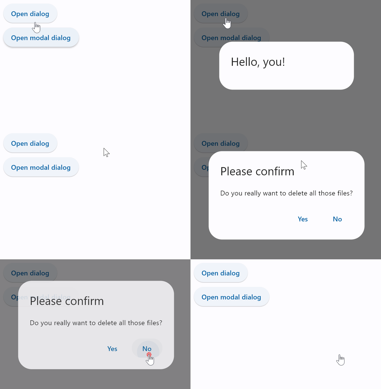
A material design alert dialog.
An alert dialog informs the user about situations that require acknowledgement. An alert dialog has an optional title and an optional list of actions. The title is displayed above the content and the actions are displayed below the content.
Examples
Basic and modal dialogs
- Python
import flet as ft

def main(page: ft.Page):
    page.title = "AlertDialog examples"

    dlg = ft.AlertDialog(
        title=ft.Text("Hello, you!"), on_dismiss=lambda e: print("Dialog dismissed!")
    )

    def close_dlg(e):
        dlg_modal.open = False
        page.update()

    dlg_modal = ft.AlertDialog(
        modal=True,
        title=ft.Text("Please confirm"),
        content=ft.Text("Do you really want to delete all those files?"),
        actions=[
            ft.TextButton("Yes", on_click=close_dlg),
            ft.TextButton("No", on_click=close_dlg),
        ],
        actions_alignment=ft.MainAxisAlignment.END,
        on_dismiss=lambda e: print("Modal dialog dismissed!"),
    )

    def open_dlg(e):
        page.dialog = dlg
        dlg.open = True
        page.update()

    def open_dlg_modal(e):
        page.dialog = dlg_modal
        dlg_modal.open = True
        page.update()

    page.add(
        ft.ElevatedButton("Open dialog", on_click=open_dlg),
        ft.ElevatedButton("Open modal dialog", on_click=open_dlg_modal),
    )

ft.app(target=main)

Properties
actions
The (optional) set of actions that are displayed at the bottom of the dialog.
Typically this is a list of TextButton controls.
actions_alignment
Defines the horizontal layout of the actions according to the same rules as for Row.alignment.
Property value is MainAxisAlignment enum with MainAxisAlignment.END as default.
actions_padding
Padding around the set of actions at the bottom of the dialog.
Typically used to provide padding to the button bar between the button bar and the edges of the dialog.
If are no actions, then no padding will be included. The padding around the button bar defaults to zero.
See Container.padding for more information about padding and possible values.
content
The (optional) content of the dialog is displayed in the center of the dialog in a lighter font. Typically this is a Column that contains the dialog's Text message.
content_padding
Padding around the content.
If there is no content, no padding will be provided. Otherwise, padding of 20 pixels is provided above the content to separate the content from the title, and padding of 24 pixels is provided on the left, right, and bottom to separate the content from the other edges of the dialog.
See Container.padding for more information about padding and possible values.
modal
Whether dialog can be dismissed by clicking the area outside of it.
open
Set to True to display a dialog.
shape
The shape of the dialog's border.
The value is an instance of one of the following implementations:
StadiumBorderRoundedRectangleBorderradius- border radius, an instance ofBorderRadiusclass or a number.
CircleBorderBeveledRectangleBorderradius- border radius, an instance ofBorderRadiusclass or a number.
CountinuosRectangleBorderradius- border radius, an instance ofBorderRadiusclass or a number.
The default shape is a RoundedRectangleBorder with a radius of 4.0.
title
The (optional) title of the dialog is displayed in a large font at the top of the dialog.
Typically a Text control.
title_padding
Padding around the title.
If there is no title, no padding will be provided. Otherwise, this padding is used.
This property defaults to providing 24 pixels on the top, left, and right of the title. If the content is not null, then no bottom padding is provided (but see content_padding). If it is not set, then an extra 20 pixels of bottom padding is added to separate the title from the actions.
See Container.padding for more information about padding and possible values.
Events
on_dismiss
Fires when dialog is dimissed.