FloatingActionButton
A material design floating action button. A floating action button is a circular icon button that hovers over content to promote a primary action in the application.
Floating action button is usually set to page.floating_action_button, but can also be added as a regular control at any place on a page.
Examples
Basic FAB
- Python
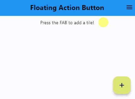
import flet as ft

def main(page: ft.Page):
    page.title = "Floating Action Button"
    page.theme_mode = ft.ThemeMode.LIGHT
    page.horizontal_alignment = ft.CrossAxisAlignment.CENTER
    page.auto_scroll = True
    page.scroll = ft.ScrollMode.HIDDEN
    page.appbar = ft.AppBar(
        title=ft.Text(
            "Floating Action Button", weight=ft.FontWeight.BOLD, color=ft.colors.BLACK87
        ),
        bgcolor=ft.colors.BLUE,
        center_title=True,
        actions=[
            ft.IconButton(ft.icons.MENU, tooltip="Menu", icon_color=ft.colors.BLACK87)
        ],
        color=ft.colors.WHITE,
    )

    # keeps track of the number of tiles already added
    page.count = 0

    def fab_pressed(e):
        page.add(ft.ListTile(title=ft.Text(f"Tile {page.count}")))
        page.show_snack_bar(
            ft.SnackBar(ft.Text("Tile was added successfully!"), open=True)
        )
        page.count += 1

    page.floating_action_button = ft.FloatingActionButton(
        icon=ft.icons.ADD, on_click=fab_pressed, bgcolor=ft.colors.LIME_300
    )
    page.add(ft.Text("Press the FAB to add a tile!"))

ft.app(target=main)
Properties
autofocus
True if the control will be selected as the initial focus. If there is more than one control on a page with autofocus set, then the first one added to the page will get focus.
bgcolor
Button background color.
content
A Control representing custom button content.
icon
Icon shown in the button.
mini
Controls the size of this button.
By default, floating action buttons are non-mini and have a height and width of 56.0 logical pixels. Mini floating action buttons have a height and width of 40.0 logical pixels with a layout width and height of 48.0 logical pixels.
shape
The shape of the FAB's border.
The value is an instance of one of the following implementations:
StadiumBorderRoundedRectangleBorderradius- border radius, an instance ofBorderRadiusclass or a number.
CircleBorderBeveledRectangleBorderradius- border radius, an instance ofBorderRadiusclass or a number.
CountinuosRectangleBorderradius- border radius, an instance ofBorderRadiusclass or a number.
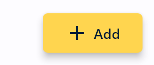
An example of using shape property:
import flet as ft

def main(page: ft.Page):

    page.floating_action_button = ft.FloatingActionButton(
        content=ft.Row(
            [ft.Icon(ft.icons.ADD), ft.Text("Add")], alignment="center", spacing=5
        ),
        bgcolor=ft.colors.AMBER_300,
        shape=ft.RoundedRectangleBorder(radius=5),
        width=100,
        mini=True,
    )

    page.add(ft.Text("Just a text!"))

ft.app(target=main)
text
The text displayed on a button.
tooltip
The text displayed when hovering the mouse over the button.
url
The URL to open when the button is clicked. If registered, on_click event is fired after that.
url_target
Where to open URL in the web mode:
_blank(default) - new tab/window._self- the current tab/window.
Events
on_click
Fires when a user clicks the button.