Container
Container allows to decorate a control with background color and border and position it with padding, margin and alignment.
Examples
Containers with different background color
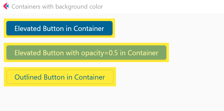
- Python
import flet as ft


def main(page: ft.Page):
    page.title = "Containers with background color"

    c1 = ft.Container(
        content=ft.ElevatedButton("Elevated Button in Container"),
        bgcolor=ft.colors.YELLOW,
        padding=5,
    )

    c2 = ft.Container(
        content=ft.ElevatedButton(
            "Elevated Button with opacity=0.5 in Container", opacity=0.5
        ),
        bgcolor=ft.colors.YELLOW,
        padding=5,
    )

    c3 = ft.Container(
        content=ft.OutlinedButton("Outlined Button in Container"),
        bgcolor=ft.colors.YELLOW,
        padding=5,
    )
    page.add(c1, c2, c3)


ft.app(target=main)
Clickable container

- Python
import flet as ft

def main(page: ft.Page):
    page.title = "Containers - clickable and not"
    page.vertical_alignment = ft.MainAxisAlignment.CENTER
    page.horizontal_alignment = ft.CrossAxisAlignment.CENTER

    page.add(
        ft.Row(
            [
                ft.Container(
                    content=ft.Text("Non clickable"),
                    margin=10,
                    padding=10,
                    alignment=ft.alignment.center,
                    bgcolor=ft.colors.AMBER,
                    width=150,
                    height=150,
                    border_radius=10,
                ),
                ft.Container(
                    content=ft.Text("Clickable without Ink"),
                    margin=10,
                    padding=10,
                    alignment=ft.alignment.center,
                    bgcolor=ft.colors.GREEN_200,
                    width=150,
                    height=150,
                    border_radius=10,
                    on_click=lambda e: print("Clickable without Ink clicked!"),
                ),
                ft.Container(
                    content=ft.Text("Clickable with Ink"),
                    margin=10,
                    padding=10,
                    alignment=ft.alignment.center,
                    bgcolor=ft.colors.CYAN_200,
                    width=150,
                    height=150,
                    border_radius=10,
                    ink=True,
                    on_click=lambda e: print("Clickable with Ink clicked!"),
                ),
                ft.Container(
                    content=ft.Text("Clickable transparent with Ink"),
                    margin=10,
                    padding=10,
                    alignment=ft.alignment.center,
                    width=150,
                    height=150,
                    border_radius=10,
                    ink=True,
                    on_click=lambda e: print("Clickable transparent with Ink clicked!"),
                ),
            ],
            alignment=ft.MainAxisAlignment.CENTER,
        ),
    )

ft.app(target=main)
Properties
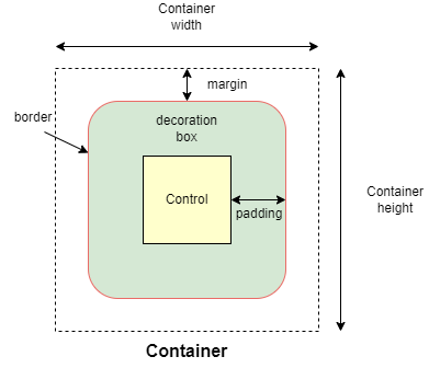
alignment
Align the child control within the container.
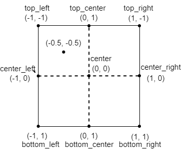
Alignment is an instance of alignment.Alignment class object with x and y properties representing the distance from the center of a rectangle. x=0, y=0 represents the center of the rectangle. x=-1, y=-1 represents the top left of the rectangle, x=1.0, y=1.0 represents the bottom right of the rectangle. There are pre-defined alignment constants in flet.alignment module: top_left, top_center, top_right, center_left, center, center_right, bottom_left, bottom_center, bottom_right.
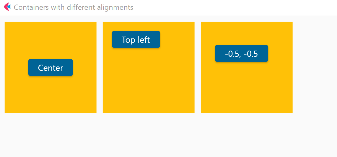
For example:
container_1.alignment = alignment.center
container_2.alignment = alignment.top_left
container_3.alignment = alignment.Alignment(-0.5, -0.5)
animate
Enables container "implicit" animation that gradually changes its values over a period of time.
The value of animate property could be one of the following types:
bool-Trueto enable container animation withlinearcurve with1000milliseconds duration.int- enable container animation withlinearcurve and specified number of milliseconds.animation.Animation(duration: int, curve: str)- enable container animation with specified duration and transition curve.
For example:
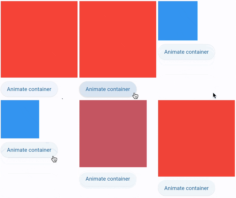
import flet as ft

def main(page: ft.Page):

    c = ft.Container(
        width=200,
        height=200,
        bgcolor="red",
        animate=ft.animation.Animation(1000, "bounceOut"),
    )

    def animate_container(e):
        c.width = 100 if c.width == 200 else 200
        c.height = 100 if c.height == 200 else 200
        c.bgcolor = "blue" if c.bgcolor == "red" else "red"
        c.update()

    page.add(c, ft.ElevatedButton("Animate container", on_click=animate_container))

ft.app(target=main)
bgcolor
Background color of the container.
A color value could be a hex value in #ARGB format (e.g. #FFCC0000), #RGB format (e.g. #CC0000) or a named color from flet.colors module.
blend_mode
The blend mode applied to the color or gradient background of the container. See ShaderMask.blend_mode for more details.
blur
Applies Gaussian blur effect under the container.
The value of this property could be one of the following:
- a number - specifies the same value for horizontal and vertical sigmas, e.g.
10. - a tuple - specifies separate values for horizontal and vertical sigmas, e.g.
(10, 1). - an instance of
ft.Blur- allow specifying separate values for horizontal and vertical sigmas as well astile_modefor the filter.tile_modeis the value offt.BlurTileModewhich defaults toft.BlurTileMode.CLAMP.
For example:
ft.Stack(
    [
        ft.Container(
            content=ft.Text("Hello"),
            image_src="https://picsum.photos/100/100",
            width=100,
            height=100,
        ),
        ft.Container(
            width=50,
            height=50,
            blur=10,
            bgcolor="#44CCCC00",
        ),
        ft.Container(
            width=50,
            height=50,
            left=10,
            top=60,
            blur=(0, 10),
        ),
        ft.Container(
            top=10,
            left=60,
            blur=ft.Blur(10, 0, ft.BlurTileMode.MIRROR),
            width=50,
            height=50,
            bgcolor="#44CCCCCC",
            border=ft.border.all(2, ft.colors.BLACK),
        ),
    ]
)
border
A border to draw above the background color.
Each side of the container border is described by an instance of border.BorderSide class with two properties: width (number) and color (string). The value of border property is an instance of border.Border class describing all 4 sides of the rectangle. Helper methods available to set border styles:
border.all(width, color)border.symmetric(vertical: BorderSide, horizontal: BorderSide)border.only(left: BorderSide, top: BorderSide, right: BorderSide, bottom: BorderSide).
For example:
container_1.border = ft.border.all(10, ft.colors.PINK_600)
container_1.border = ft.border.only(bottom=ft.border.BorderSide(1, "black"))
border_radius
If specified, the corners of the container are rounded by this radius. Border radius is an instance of border_radius.BorderRadius class with 4 properties: top_left, top_right, bottom_left, bottom_right. The object could be created with a constructor where all corner values set separately or with helper methods:
border_radius.all(value)border_radius.horizontal(left: float = 0, right: float = 0)border_radius.vertical(top: float = 0, bottom: float = 0)border_radius.only(top_left, top_right, bottom_left, bottom_right)
For example:
container_1.border_radius= ft.border_radius.all(30)
clip_behavior
The content will be clipped (or not) according to this option.
Property value is ClipBehavior enum with supported values:
NONEANTI_ALIASANTI_ALIAS_WITH_SAVE_LAYERHARD_EDGE
Default is ANTI_ALIAS if border_radius is not None; otherwise HARD_EDGE.
content
A child Control contained by the container.
gradient
Configures gradient background. The value must be an instance of one of the following classes:
LinearGradientRadialGradientSweepGradient
LinearGradient
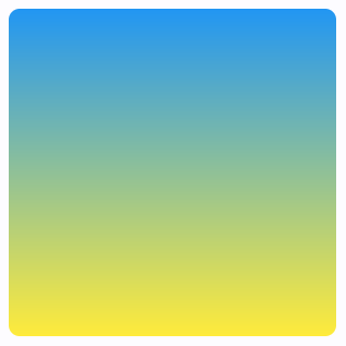
Container(
    gradient=ft.LinearGradient(
        begin=ft.alignment.top_center,
        end=ft.alignment.bottom_center,
       colors=[ft.colors.BLUE, ft.colors.YELLOW],
    ),
    width=150,
    height=150,
    border_radius=5,
)
LinearGradient class has the following properties:
begin- An instance ofAlignmentclass. The offset at which stop 0.0 of the gradient is placed.end- An instance ofAlignmentclass. The offset at which stop 1.0 of the gradient is placed.colors- The colors the gradient should obtain at each of the stops. If stops is non-null, this list must have the same length as stops. This list must have at least two colors in it (otherwise, it's not a gradient!).stops- A list of values from 0.0 to 1.0 that denote fractions along the gradient. If non-null, this list must have the same length ascolors. If the first value is not 0.0, then a stop with position 0.0 and a color equal to the first color incolorsis implied. If the last value is not 1.0, then a stop with position 1.0 and a color equal to the last color incolorsis implied.tile_mode- How this gradient should tile the plane beyond in the region beforebeginand afterend. The value isGradientTileModeenum with supported values:CLAMP(default),DECAL,MIRROR,REPEATED. More info here.rotation- rotation for the gradient, in radians, around the center-point of its bounding box.
More information:
- Linear gradient in Flutter documentation.
- Radian measuring unit on Wikipedia.
RadialGradient
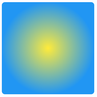
Container(
    gradient=ft.RadialGradient(
       colors=[ft.colors.YELLOW, ft.colors.BLUE],
    ),
    width=150,
    height=150,
    border_radius=5,
)
RadialGradient class has the following properties:
colors,stops,tile_mode,rotation- see Linear gradient for description of these properties.center- An instance ofAlignmentclass. The center of the gradient, as an offset into the (-1.0, -1.0) x (1.0, 1.0) square describing the gradient which will be mapped onto the paint box. For example, an alignment of (0.0, 0.0) will place the radial gradient in the center of the box.radius- The radius of the gradient, as a fraction of the shortest side of the paint box. For example, if a radial gradient is painted on a box that is 100.0 pixels wide and 200.0 pixels tall, then a radius of 1.0 will place the 1.0 stop at 100.0 pixels from thecenter.focal- The focal point of the gradient. If specified, the gradient will appear to be focused along the vector fromcenterto focal.focal_radius- The radius of the focal point of gradient, as a fraction of the shortest side of the paint box. For example, if a radial gradient is painted on a box that is 100.0 pixels wide and 200.0 pixels tall, then a radius of 1.0 will place the 1.0 stop at 100.0 pixels from the focal point.
More information:
- Radial gradient in Flutter documentation.
SweepGradient
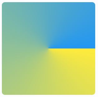
Container(
    gradient=SweepGradient(
        center=ft.alignment.center,
        start_angle=0.0,
        end_angle=math.pi * 2,
       colors=[ft.colors.YELLOW, ft.colors.BLUE],
    ),
    width=150,
    height=150,
    border_radius=5,
)
SweepGradient class has the following properties:
colors,stops,tile_mode,rotation- see Linear gradient for description of these properties.center- The center of the gradient, as an offset into the (-1.0, -1.0) x (1.0, 1.0) square describing the gradient which will be mapped onto the paint box. For example, an alignment of (0.0, 0.0) will place the sweep gradient in the center of the box.start_angle- The angle in radians at which stop 0.0 of the gradient is placed. Defaults to 0.0.end_angle- The angle in radians at which stop 1.0 of the gradient is placed. Defaults to math.pi * 2.
More information:
- Sweep gradient in Flutter documentation.
image_fit
See Image.fit for more details.
image_opacity
Sets image opacity when blending with a background: value between 0.0 and 1.0.
image_repeat
See Image.repeat for more details.
image_src
Sets an image as a container background. See Image.src for more details.
image_src_base64
Sets an image encoded as Base-64 string as a container background. See Image.src_base64 for more details.
ink
True to produce ink ripples effect when user clicks the container. Default is False.
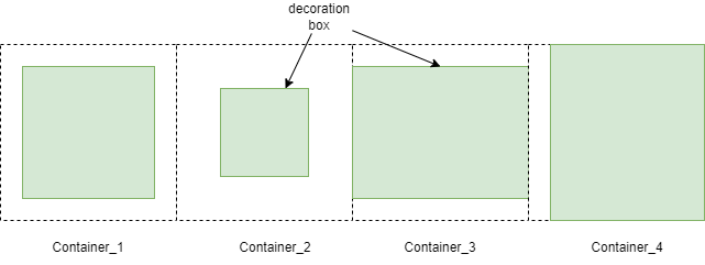
margin
Empty space to surround the decoration and child control.
Margin is an instance of margin.Margin class with properties set margins for all sides of the rectangle: left, top, right, bottom. An instance of margin.Margin can be created via constructor with values for specific sides or created with helper methods:
margin.all(value)margin.symmetric(vertical, horizontal)margin.only(left, top, right, bottom)
For example:
container_1.margin = margin.all(10)
container_2.margin = 20 # same as margin.all(20)
container_3.margin = margin.symmetric(vertical=10)
container_3.margin = margin.only(left=10)
padding
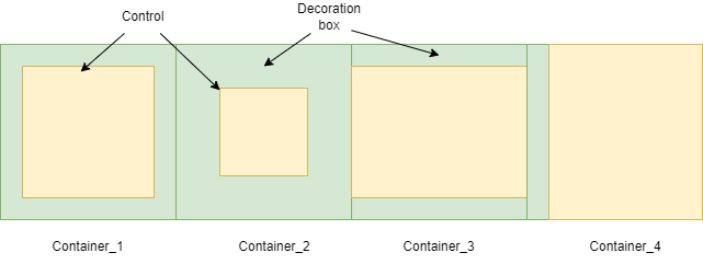
Empty space to inscribe inside a container decoration (background, border). The child control is placed inside this padding.
Padding is an instance of padding.Padding class with properties set padding for all sides of the rectangle: left, top, right, bottom. An instance of padding.Padding can be created via constructor with values for specific sides or created with helper methods:
padding.all(value: float)padding.symmetric(vertical, horizontal)padding.only(left, top, right, bottom)
For example:
container_1.padding = ft.padding.all(10)
container_2.padding = 20 # same as ft.padding.all(20)
container_3.padding = ft.padding.symmetric(horizontal=10)
container_4.padding=padding.only(left=10)
shadow
A list of shadows cast by the container.
The value of this property is a single instance or a list of ft.BoxShadow class instances with the following properties:
spread_radius- The amount the box should be inflated prior to applying the blur. Default is0.0..blur_radius- The standard deviation of the Gaussian to convolve with the shadow's shape. Default is0.0..color- Color that the shadow will be drawn with.offset- An instance offt.Offsetclass - the displacement of the shadow from the casting element. Positive x/y offsets will shift the shadow to the right and down, while negative offsets shift the shadow to the left and up. The offsets are relative to the position of the element that is casting it. Default isft.Offset(0,0).blur_style- Theft.BlurStyleto use for this shadow. Defaults toft.BlurStyle.NORMAL.
Example:
ft.Container(
    border_radius=10,
    width=100,
    height=100,
    shadow=ft.BoxShadow(
        spread_radius=1,
        blur_radius=15,
        color=ft.colors.BLUE_GREY_300,
        offset=ft.Offset(0, 0),
        blur_style=ft.ShadowBlurStyle.OUTER,
    )
)
shape
Sets the shape of the container. The value is BoxShape enum:
RECTANGLE(default)CIRCLE
theme_mode
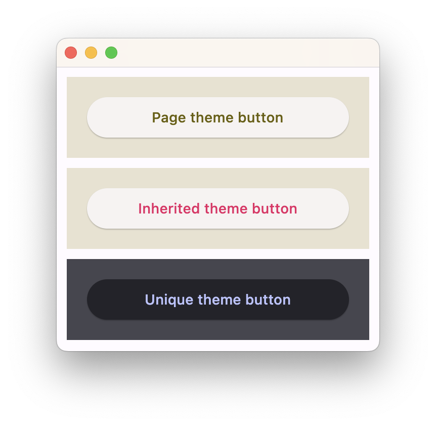
Setting theme_mode (ft.ThemeMode) "resets" parent theme and creates a new, unique scheme for all controls inside the container. Otherwise the styles defined in container's theme property override corresponding styles from the parent, inherited theme.
theme
Allows setting a nested ft.Theme for all controls inside the container and down the tree, for example:
import flet as ft

def main(page: ft.Page):
    # Yellow page theme with SYSTEM (default) mode
    page.theme = ft.Theme(
        color_scheme_seed=ft.colors.YELLOW,
    )

    page.add(
        # Page theme
        ft.Container(
            content=ft.ElevatedButton("Page theme button"),
            bgcolor=ft.colors.SURFACE_VARIANT,
            padding=20,
            width=300,
        ),

        # Inherited theme with primary color overridden
        ft.Container(
            theme=ft.Theme(color_scheme=ft.ColorScheme(primary=ft.colors.PINK)),
            content=ft.ElevatedButton("Inherited theme button"),
            bgcolor=ft.colors.SURFACE_VARIANT,
            padding=20,
            width=300,
        ),

        # Unique always DARK theme
        ft.Container(
            theme=ft.Theme(color_scheme_seed=ft.colors.INDIGO),
            theme_mode=ft.ThemeMode.DARK,
            content=ft.ElevatedButton("Unique theme button"),
            bgcolor=ft.colors.SURFACE_VARIANT,
            padding=20,
            width=300,
        ),
    )

ft.app(main)
url
The URL to open when the container is clicked. If registered, on_click event is fired after that.
url_target
Where to open URL in the web mode:
_blank(default) - new tab/window._self- the current tab/window.
Events
on_click
Fires when a user clicks the container. Event object e is an instance of ContainerTapEvent class:
class ft.ContainerTapEvent():
    local_x: float
    local_y: float
    global_x: float
    global_y: float
If ink is True, e will be plain ControlEvent with empty data instead of ContainerTapEvent.
A simple usage example:
import flet as ft

def main(page: ft.Page):
    page.vertical_alignment = ft.MainAxisAlignment.CENTER
    page.horizontal_alignment = ft.CrossAxisAlignment.CENTER

    t = ft.Text()

    def container_click(e: ft.ContainerTapEvent):
        t.value = f"local_x: {e.local_x}\nlocal_y: {e.local_y}\nglobal_x: {e.global_x}\nglobal_y: {e.global_y}"
        t.update()

    page.add(
        ft.Column(
            [
                ft.Container(
                    content=ft.Text("Clickable inside container"),
                    alignment=ft.alignment.center,
                    bgcolor=ft.colors.GREEN_200,
                    width=200,
                    height=200,
                    border_radius=10,
                    on_click=container_click,
                ),
                t,
            ],
            horizontal_alignment=ft.CrossAxisAlignment.CENTER,
        ),
    )

ft.app(target=main)
on_hover
Fires when a mouse pointer enters or exists the container area. data property of event object contains true (string) when cursor enters and false when it exits.
A simple example of a container changing its background color on mouse hover:
import flet as ft

def main(page: ft.Page):
    def on_hover(e):
        e.control.bgcolor = "blue" if e.data == "true" else "red"
        e.control.update()

    page.add(
        ft.Container(width=100, height=100, bgcolor="red", ink=False, on_hover=on_hover)
    )

ft.app(target=main)
on_long_press
Fires when the container is long-pressed.