ResponsiveRow
ResponsiveRow borrows the idea of grid layout from Bootstrap web framework.
ResponsiveRow allows aligning child controls to virtual columns. By default, a virtual grid has 12 columns, but that can be customized with ResponsiveRow.columns property.
Similar to expand property, every control now has col property which allows specifying how many columns a control should span. For example, to make a layout consisting of two columns spanning 6 virtual columns each:
import flet as ft

ft.ResponsiveRow([
    ft.Column(col=6, controls=[ft.Text("Column 1")]),
    ft.Column(col=6, controls=[ft.Text("Column 2")])
])
ResponsiveRow is "responsive" because it can adapt the size of its children to a changing screen (page, window) size. col property in the example above is a constant number which means the child will span 6 columns for any screen size.
If ResponsiveRow's child doesn't have col property specified it spans the maximum number of columns.
col can be configured to have a different value for specific "breakpoints". Breakpoints are named dimension ranges:
| Breakpoint | Dimension |
|---|---|
| xs | <576px |
| sm | ≥576px |
| md | ≥768px |
| lg | ≥992px |
| xl | ≥1200px |
| xxl | ≥1400px |
For example, the following example collapses content into a single column on a mobile device and takes two columns on larger screens:
import flet as ft

ft.ResponsiveRow([
    ft.Column(col={"sm": 6}, controls=[ft.Text("Column 1")]),
    ft.Column(col={"sm": 6}, controls=[ft.Text("Column 2")])
])
Examples
ResponsiveRow
- Python
import flet as ft
def main(page: ft.Page):
def page_resize(e):
pw.value = f"{page.width} px"
pw.update()
page.on_resize = page_resize
pw = ft.Text(bottom=50, right=50, style="displaySmall")
page.overlay.append(pw)
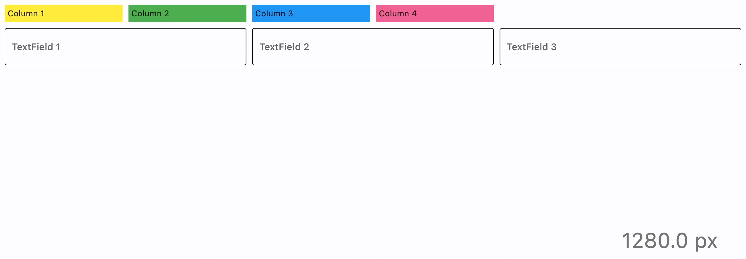
page.add(
ft.ResponsiveRow(
[
ft.Container(
ft.Text("Column 1"),
padding=5,
bgcolor=ft.colors.YELLOW,
col={"sm": 6, "md": 4, "xl": 2},
),
ft.Container(
ft.Text("Column 2"),
padding=5,
bgcolor=ft.colors.GREEN,
col={"sm": 6, "md": 4, "xl": 2},
),
ft.Container(
ft.Text("Column 3"),
padding=5,
bgcolor=ft.colors.BLUE,
col={"sm": 6, "md": 4, "xl": 2},
),
ft.Container(
ft.Text("Column 4"),
padding=5,
bgcolor=ft.colors.PINK_300,
col={"sm": 6, "md": 4, "xl": 2},
),
],
),
ft.ResponsiveRow(
[
ft.TextField(label="TextField 1", col={"md": 4}),
ft.TextField(label="TextField 2", col={"md": 4}),
ft.TextField(label="TextField 3", col={"md": 4}),
],
run_spacing={"xs": 10},
),
)
page_resize(None)
ft.app(target=main)
Properties
alignment
How the child Controls should be placed horizontally.
For example, MainAxisAlignment.START, the default, places the children on the left of a Row.
Property value is MainAxisAlignment enum with the following values:
START(default)ENDCENTERSPACE_BETWEENSPACE_AROUNDSPACE_EVENLY
columns
The number of virtual columns to layout children. Default is 12.
controls
A list of Controls to display inside the ResponsiveRow.
run_spacing
Spacing between runs when row content is wrapped on multiple lines. Default value is 10.
spacing
Spacing between controls in a row. Default value is 10 virtual pixels. Spacing is applied only when alignment is set to start, end or center.
vertical_alignment
How the child Controls should be placed vertically.
Property value is CrossAxisAlignment enum with the following values:
START(default)CENTERENDSTRETCHBASELINE